
EspressChartではチャート上に各種オブジェクトを追加し、グラフに補足を追加することが可能です。今回はどのようなオブジェクトが配置できるのか、具体的なサンプルを使用して紹介していきます。
Contents
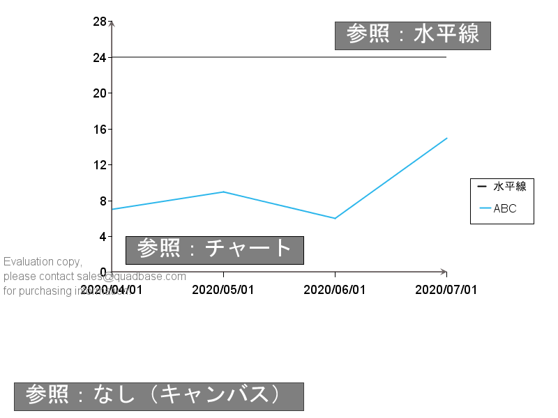
注釈:IAnnotation
注釈(IAnnotation)はチャート自体やIDataLineSetで描画している線に対する相対位置を指定して描画できるテキストボックスです。ボックスとしての背景や枠線も含めて描画できます。また、何も参照しないように設定すればキャンバス上の座標を基に描画することもできます。
import java.applet.Applet;
import java.awt.Color;
import java.awt.Font;
import java.io.IOException;

import quadbase.ChartAPI.*;
import quadbase.util.*;

public class IAnnotationSetDemo {
    public static void main(String[] args) {
        // EspressManagerを使用しない、エクスポートのみ
        QbChart.setEspressManagerUsed(false);
        QbChart.setForExportOnly(true);

        String dataType[] = {"varchar", "date", "int"};
        String fieldName[] = {"Series", "month", "Y"};

        ColInfo col = new ColInfo();
        col.value = 2;
        col.series = 0;
        col.category = 1;

        Applet parent = null;

        // 適当なソースデータを作成
        String records[][] = {
            {"ABC", "2020-04-01", "7"}, {"ABC", "2020-05-01", "9"},
            {"ABC", "2020-06-01", "6"}, {"ABC", "2020-07-01", "15"},
        };
        DbData data = new DbData(dataType, fieldName, records);

        // 適当な折れ線チャートを作成
        QbChart chart = new QbChart(parent,
            QbChart.VIEW2D,
            QbChart.LINE,
            data,
            col,
            null);

        // チャート位置を調整
        IPlot plot = chart.gethChartPlot();
        plot.setPosition(new Position(0.2f, 0.05f));

        // 水平線を描画
        IDataLineSet lineset = chart.gethDataLines();
        IHorzVertLine hline = lineset.newHorzVertLine(
            IHorzVertLine.HORIZONTAL_LINE, "水平線");
        hline.setLineValue(24.0);
        lineset.add(hline);

        // 共通で使用
        Font font = new Font("MS ゴシック", Font.PLAIN, 16);
        Color color = Color.white;
        Color backcolor = new Color(0, 0, 0, 128);
        Color bordercolor = Color.black;

        // IAnnotationSetを作成
        IAnnotationSet annoset = chart.gethAnnotations();

        // 注釈(Annotation)を作成
        IAnnotation anno1 = annoset.newAnnotation("参照:チャート");
        // デザインを調整
        anno1.setFont(font);
        anno1.setColor(color);
        anno1.setBorderColor(bordercolor);
        anno1.setBorderVisible(true);
        anno1.setBackgroundVisible(true);
        anno1.setBackgroundColor(backcolor);
        // チャート原点との相対位置(デフォルト、chart参照)に設定
        anno1.setReferenceObject(chart.getChart());
        // チャートと重ならないように位置を調整
        anno1.setRelativePosition(new Point_2D(0.025f, 0.05f));
        // 注釈を追加
        annoset.addAnnotation(anno1);

        // 注釈(Annotation)を作成
        IAnnotation anno2 = annoset.newAnnotation("参照:水平線");
        // デザインを調整
        anno2.setFont(font);
        anno2.setColor(color);
        anno2.setBorderColor(backcolor);
        anno2.setBorderVisible(true);
        anno2.setBackgroundVisible(true);
        anno2.setBackgroundColor(backcolor);
        // 水平線との相対位置(hline参照)に設定
        anno2.setReferenceObject(hline);
        // チャートと重ならないように位置を調整
        anno2.setRelativePosition(new Point_2D(-0.2f, 0.05f));
        // 注釈を追加
        annoset.addAnnotation(anno2);

        // 注釈(Annotation)を作成
        IAnnotation anno3 = annoset.newAnnotation("参照:なし(キャンバス)");
        // デザインを調整
        anno3.setFont(font);
        anno3.setColor(color);
        anno3.setBorderColor(backcolor);
        anno3.setBorderVisible(true);
        anno3.setBackgroundVisible(true);
        anno3.setBackgroundColor(backcolor);
        // キャンバスの左下との相対位置(参照なし)に設定
        anno3.setReferenceObject(null);
        // キャンバス内に収まるように位置を調整
        anno3.setRelativePosition(new Point_2D(0.025f, 0.05f));
        // 注釈を追加
        annoset.addAnnotation(anno3);

        // 画像をエクスポート
        try {
            chart.export(QbChart.PNG, "IAnnotationSetDemo.png", 800, 600);
        } catch (IOException e) {
            e.printStackTrace();
        }
    }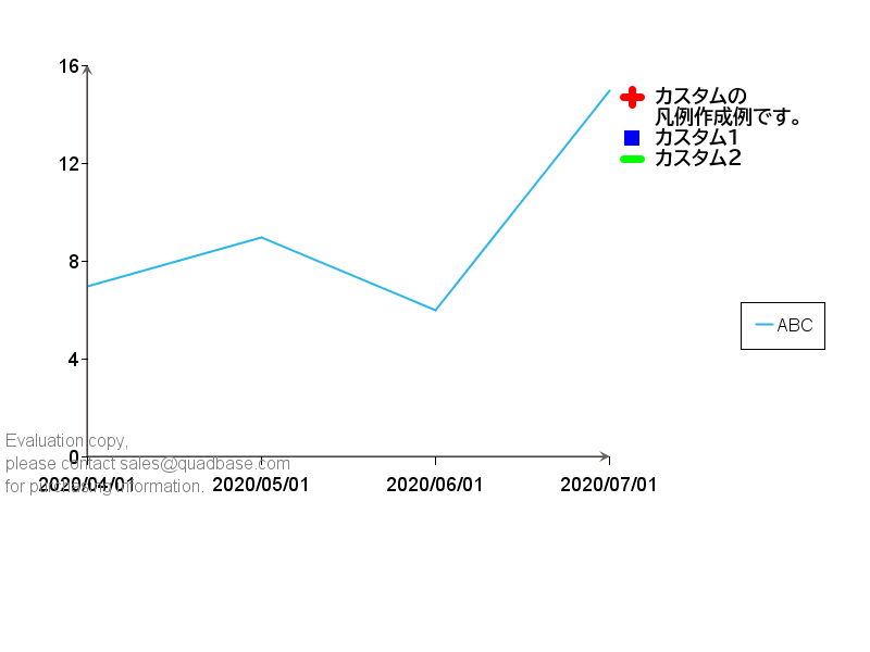
}また、テキストだけではなく、シンボルと組み合わせて描画することもできます。下記のようにチャートプロットに依存しないカスタムの凡例を作成することも可能です。
import java.applet.Applet;
import java.awt.Color;
import java.awt.Font;
import java.io.IOException;

import quadbase.ChartAPI.*;
import quadbase.util.*;

public class CreateCustomLegend {
    public static void main(String[] args) {
        // EspressManagerを使用しない、エクスポートのみ
        QbChart.setEspressManagerUsed(false);
        QbChart.setForExportOnly(true);

        String dataType[] = {"varchar", "date", "int"};
        String fieldName[] = {"Series", "month", "Y"};

        ColInfo col = new ColInfo();
        col.value = 2;
        col.series = 0;
        col.category = 1;

        Applet parent = null;

        // 適当なソースデータを作成
        String records[][] = {
            {"ABC", "2020-04-01", "7"}, {"ABC", "2020-05-01", "9"},
            {"ABC", "2020-06-01", "6"},{"ABC", "2020-07-01", "15"},
        };
        DbData data = new DbData(dataType, fieldName, records);

        // 適当な折れ線チャートを作成
        QbChart chart = new QbChart(parent,
            QbChart.VIEW2D,
            QbChart.LINE,
            data,
            col,
            null);

        // チャート位置を調整
        IPlot plot = chart.gethChartPlot();
        plot.setPosition(new Position(0.1f, 0.1f));

        // 注釈で使用する文字列、シンボル形状、シンボル色の配列を作成
        String[] texts =
            {"カスタムの", "凡例作成例です。", "カスタム1", "カスタム2"};
        int[] shapes =
            {QbChart.PLUS, QbChart.NOSYMBOL, QbChart.SQUARE, QbChart.DASH};
        Color[] colors =
            {Color.red, Color.black, Color.blue, Color.green};

        // 上記で注釈を作成
        IAnnotationSet annoset = chart.gethAnnotations();
        IAnnotation anno = annoset.newAnnotation(texts, shapes, colors);

        // デザインや位置を調整
        anno.setFont(new Font("BIZ UDPゴシック", Font.BOLD, 9));
        Point_2D newPosition = new Point_2D(.6f, .5f);
        anno.setRelativePosition(newPosition);
        annoset.addAnnotation(anno);

        try {
            chart.export(QbChart.PNG, "CreateCustomLegend.png", 800, 600);
        } catch (IOException e) {
            e.printStackTrace();
        }
    }
}
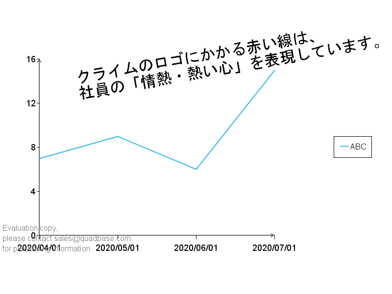
テキスト:IFloatingTextSet
注釈とは異なり、あくまでもチャートプロット上にテキスト文字列のみを配置します。
import java.applet.Applet;
import java.awt.Color;
import java.awt.Font;
import java.io.IOException;

import quadbase.ChartAPI.*;
import quadbase.util.*;

public class IFloatingTextSetDemo {
    public static void main(String[] args) {
        // EspressManagerを使用しない、エクスポートのみ
        QbChart.setEspressManagerUsed(false);
        QbChart.setForExportOnly(true);

        String dataType[] = {"varchar", "date", "int"};
        String fieldName[] = {"Series", "month", "Y"};

        ColInfo col = new ColInfo();
        col.value = 2;
        col.series = 0;
        col.category = 1;

        Applet parent = null;

        // 適当なソースデータを作成
        String records[][] = {
            { "ABC","2020-04-01","7" }, { "ABC","2020-05-01","9"},
            { "ABC","2020-06-01","6"}, { "ABC","2020-07-01","15" },
        };
        DbData data = new DbData(dataType, fieldName, records);

        // 適当な折れ線チャートを作成
        QbChart chart = new QbChart(parent,
            QbChart.VIEW2D,
            QbChart.LINE,
            data,
            col,
            null);

        // チャート位置を調整
        IPlot plot = chart.gethChartPlot();
        plot.setPosition(new Position(0.1f, 0.2f));

        Font font = new Font("MS ゴシック", Font.PLAIN, 16);
        Color color = Color.black;

        IFloatingTextSet textset = chart.gethFloatingText();
        TextString text = new TextString(
            "クライムのロゴにかかる赤い線は、\n社員の「情熱・熱い心」を表現しています。",
            font, //フォント
            color, //テキストの色
            10, //角度(反時計回り)
            0.8f, //チャートに対するテキストのx位置(0-1)
            1.0f); //チャートに対するテキストのy位置(0-1)

        textset.add(text);

        try {
            chart.export(QbChart.PNG, "IFloatingTextSetDemo.png", 800, 600);
        } catch (IOException e) {
            e.printStackTrace();
        }
    }
}
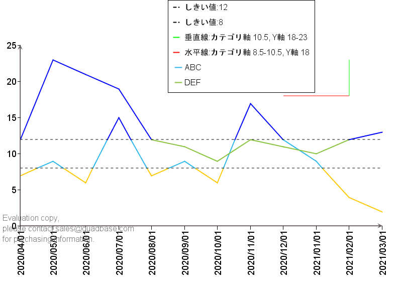
水平線、垂直線:IHorzVertLine
指定した値に基づいた水平線、垂直線を描画します。カテゴリ軸の値については、軸の値(文字列や日付)を指定するのではなく、カテゴリの項目ごとに1増加していき、それぞれの項目自体は0~1の中心となるような値をしていします。下記グラフであれば4/1が0.5、5/1が1.5、6/1は2.5といった値となります。
線の範囲も指定でき、特定の値の水平線をどこからどこまで描画するかといった指定も可能です。
加えて、値を指定する軸(下記ではY軸)を指定する線(下記では水平線)に関しては、その上下で、チャートプロットの色を変更するような設定も可能です。
import java.applet.Applet;
import java.awt.Color;
import java.io.IOException;

import quadbase.ChartAPI.*;
import quadbase.util.*;

public class IHorzVertLineDemo {
	public static void main(String[] args){
		// EspressManagerを使用しない、エクスポートのみ
		QbChart.setEspressManagerUsed(false);
		QbChart.setForExportOnly(true);

		String dataType[] = {"varchar", "date", "int"};
		String fieldName[] = {"Series", "month", "Y"};

		ColInfo col = new ColInfo();
		col.value=2;
		col.series=0;
		col.category=1;

		Applet parent = null;

		// 適当なソースデータを作成
		String records1[][] = {
				{ "ABC","2020-04-01","7" }, { "ABC","2020-05-01","9"},
				{ "ABC","2020-06-01","6"}, { "ABC","2020-07-01","15" },
				{ "ABC","2020-08-01","7" }, { "ABC","2020-09-01","9"},
				{ "ABC","2020-10-01","6"}, { "ABC","2020-11-01","17" },
				{ "ABC","2020-12-01","12"}, { "ABC","2021-01-01","9"},
				{ "ABC","2021-02-01","4" }, { "ABC","2021-03-01","2" },
				{ "DEF","2020-04-01","12" }, { "DEF","2020-05-01","23"},
				{ "DEF","2020-06-01","21"}, { "DEF","2020-07-01","19" },
				{ "DEF","2020-08-01","12" }, { "DEF","2020-09-01","11"},
				{ "DEF","2020-10-01","9"}, { "DEF","2020-11-01","12" },
				{ "DEF","2020-12-01","11"}, { "DEF","2021-01-01","10"},
				{ "DEF","2021-02-01","12" }, { "DEF","2021-03-01","13" },
		};
		DbData data = new DbData(dataType, fieldName, records1);

		// 適当な折れ線チャートを作成
		QbChart chart = new QbChart(parent,
				QbChart.VIEW2D,
				QbChart.LINE,
				data,
				col,
				null);

		// チャート位置を調整
		IPlot plot = chart.gethChartPlot();
		plot.setPosition(new Position(0.05f,0.15f));
		plot.setRelativeWidth(.9f);

		// 凡例位置を調整
		ILegend legend = chart.gethLegend();
		legend.setPosition(new Position(0.6f,0.75f));

	    // Y軸値18の水平線をカテゴリ軸の8.5項目から10.5項目に赤で描画
	    IDataLineSet lineset = chart.gethDataLines();
	    IHorzVertLine hline = lineset.newHorzVertLine
	    		(IHorzVertLine.HORIZONTAL_LINE,
	    				"水平線:カテゴリ軸 8.5-10.5, Y軸 18");
	    hline.setLineValue(18);
	    hline.setColor(Color.red);
	    hline.setLineFromValue(8.5);
	    hline.setLineToValue(10.5);
	    lineset.add(hline);

	    // カテゴリ軸10.5項目の垂直線をY軸値18から23に緑で描画
	    IHorzVertLine vline = lineset.newHorzVertLine
	    		(IHorzVertLine.VERTICAL_LINE,
	    				"垂直線:カテゴリ軸 10.5, Y軸 18-23");
	    vline.setLineValue(10.5);
	    vline.setColor(Color.green);
	    vline.setLineFromValue(18);
	    vline.setLineToValue(23);
	    lineset.add(vline);

        // Y軸値8の水平線を点線で描画し、それ以下のプロットをオレンジに
	    IHorzVertLine threshold1 = lineset.newHorzVertLine
	    		(IHorzVertLine.HORIZONTAL_LINE, "しきい値:8");
	    threshold1.setLineValue(8);
	    threshold1.setLineStyle(IDataLine.DOTTED_STYLE);
	    threshold1.setColorBelowLine(Color.orange);
	    lineset.add(threshold1);

	    // Y軸値12の水平線を点線で描画し、それ以上のプロットを青に
	    IHorzVertLine threshold2 = lineset.newHorzVertLine
	    		(IHorzVertLine.HORIZONTAL_LINE, "しきい値:12");
	    threshold2.setLineValue(12);
	    threshold2.setLineStyle(IDataLine.DOTTED_STYLE);
	    threshold2.setColorAboveLine(Color.blue);
	    lineset.add(threshold2);

		try {
			chart.export(QbChart.PNG,"IHorzVertLineDemo.png",800,600);
		} catch (IOException e) {e.printStackTrace();}
	}
}コントロールライン:IControlLine
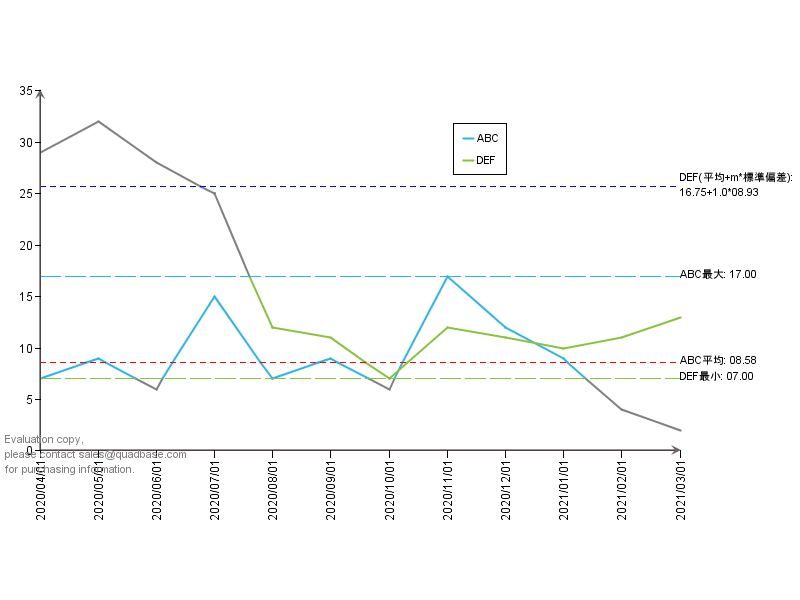
グラフの最小値や最大値、平均、標準偏差といったデータソースによって動的に変わる値の描画が可能です。
- CONTROL_AVERAGE:平均
- MAXIMUM:最大
- MINIMUM:最小
- STANDARD_DEVIATION:標準偏差
標準偏差に関しては平均+m✕標準偏差の値に線が描画されます。mはsetLineValueで指定可能です。
import java.applet.Applet;
import java.awt.Color;
import java.io.IOException;
import java.text.DecimalFormat;

import quadbase.ChartAPI.*;
import quadbase.util.*;

public class IControlLineDemo {
	public static void main(String[] args){
		// EspressManagerを使用しない、エクスポートのみ
		QbChart.setEspressManagerUsed(false);
		QbChart.setForExportOnly(true);

		String dataType[] = {"varchar", "date", "int"};
		String fieldName[] = {"Series", "month", "Y"};

		ColInfo col = new ColInfo();
		col.value=2;
		col.series=0;
		col.category=1;

		Applet parent = null;

		// 適当なソースデータを作成
		String records1[][] = {
				{ "ABC","2020-04-01","7" }, { "ABC","2020-05-01","9"},
				{ "ABC","2020-06-01","6"}, { "ABC","2020-07-01","15" },
				{ "ABC","2020-08-01","7" }, { "ABC","2020-09-01","9"},
				{ "ABC","2020-10-01","6"}, { "ABC","2020-11-01","17" },
				{ "ABC","2020-12-01","12"}, { "ABC","2021-01-01","9"},
				{ "ABC","2021-02-01","4" }, { "ABC","2021-03-01","2" },
				{ "DEF","2020-04-01","29" }, { "DEF","2020-05-01","32"},
				{ "DEF","2020-06-01","28"}, { "DEF","2020-07-01","25" },
				{ "DEF","2020-08-01","12" }, { "DEF","2020-09-01","11"},
				{ "DEF","2020-10-01","7"}, { "DEF","2020-11-01","12" },
				{ "DEF","2020-12-01","11"}, { "DEF","2021-01-01","10"},
				{ "DEF","2021-02-01","11" }, { "DEF","2021-03-01","13" },
		};
		DbData data = new DbData(dataType, fieldName, records1);

		// 適当な折れ線チャートを作成
		QbChart chart = new QbChart(parent,
				QbChart.VIEW2D,
				QbChart.LINE,
				data,
				col,
				null);

		// チャート位置、幅を調整
		IPlot plot = chart.gethChartPlot();
		plot.setPosition(new Position(0.05f,0.15f));
		plot.setRelativeWidth(.8f);

		// 凡例位置を調整
		ILegend legend = chart.gethLegend();
		legend.setPosition(new Position(0.6f,0.75f));

		// 数値用にフォーマット作成
		DecimalFormat f = new DecimalFormat("00.00");

		// 共通で使用するIDataLineSet。IDataPointSet、IAnnotationSetを取得
	    IDataLineSet lineset = chart.gethDataLines();
	    IDataPointSet point = chart.gethDataPoints();
	    IAnnotationSet annoset = chart.gethAnnotations();

	    // 最大値線を作成
	    IControlLine max = lineset.newControlLine(
	    		IControlLine.MAXIMUM, "ABC最大");
	    // ABCを参照
	    max.setSeries("ABC");
	    // 色をABCと同じに
	    max.setColor(point.getColors()[0]);
	    // 破線に設定
	    max.setLineStyle(IDataLine.DASH_STYLE);
	    // この値よりも大きいデータプロットをグレイに
	    max.setColorAboveLine(Color.gray);
	    // 凡例には非表示
	    max.setTitleVisibleInLegend(false);
	    // 最大値線を追加
	    lineset.add(max);
	    // 注釈で最大値ラベルを作成
	    IAnnotation annomax = annoset.newAnnotation(
	    		max.getTitle()+": "+f.format(max.getMax()));
	    annomax.setReferenceObject(max);
	    annoset.addAnnotation(annomax);

	    // 最小値線を作成
	    IControlLine min = lineset.newControlLine(
	    		IControlLine.MINIMUM, "DEF最小");
	    // DEFを参照
	    min.setSeries("DEF");
	    // 色をDEFと同じに
	    min.setColor(point.getColors()[1]);
	    // 破線に設定
	    min.setLineStyle(IDataLine.DASH_STYLE);
	    // この値よりも小さいデータプロットをグレイに
	    min.setColorBelowLine(Color.gray);
	    // 凡例には非表示
	    min.setTitleVisibleInLegend(false);
	    // 最小値線を追加
	    lineset.add(min);
	    // 注釈で最小値ラベルを作成
	    IAnnotation annomin = annoset.newAnnotation(
	    		min.getTitle()+": "+f.format(min.getMin()));
	    annomin.setReferenceObject(min);
	    annoset.addAnnotation(annomin);

	    // 平均線を作成
	    IControlLine avg = lineset.newControlLine(
	    		IControlLine.CONTROL_AVERAGE, "ABC平均");
	    // ABCを参照
	    avg.setSeries("ABC");
	    // 色を赤に
	    avg.setColor(Color.red);
	    // 点線に設定
	    avg.setLineStyle(IDataLine.DOTTED_STYLE);
	    // 凡例には非表示
	    avg.setTitleVisibleInLegend(false);
	    // 平均線を追加
	    lineset.add(avg);
	    // 注釈で平均値ラベルを作成
	    IAnnotation annoavg = annoset.newAnnotation(
	    		avg.getTitle()+": "+f.format(avg.getAverage()));
	    annoavg.setReferenceObject(avg);
	    annoset.addAnnotation(annoavg);

	    // 標準偏差線を作成
	    IControlLine std = lineset.newControlLine(
	    		IControlLine.STANDARD_DEVIATION, "DEF(平均+m*標準偏差)");
	    // DEFを参照
	    std.setSeries("DEF");
	    // 色を青に
	    std.setColor(Color.blue);
	    // 係数mを1に
	    // 標準偏差線は平均値+m×標準偏差値の値に線を描画します。
	    std.setLineValue(1);
	    // 点線に設定
	    std.setLineStyle(IDataLine.DOTTED_STYLE);
	    // 凡例には非表示
	    std.setTitleVisibleInLegend(false);
	    // 注釈で標準偏差値ラベルを作成
	    lineset.add(std);
	    IAnnotation annostd = annoset.newAnnotation(
	    		std.getTitle()+": \n"+f.format(std.getAverage())+
	    		"+"+std.getLineValue()+"*"+f.format(std.getStandardDev()));
	    annostd.setReferenceObject(std);
	    annoset.addAnnotation(annostd);

	    // 画像にエクスポート
		try {
			chart.export(QbChart.PNG,"IControlLineDemo.png",800,600);
		} catch (IOException e) {e.printStackTrace();}
	}
}
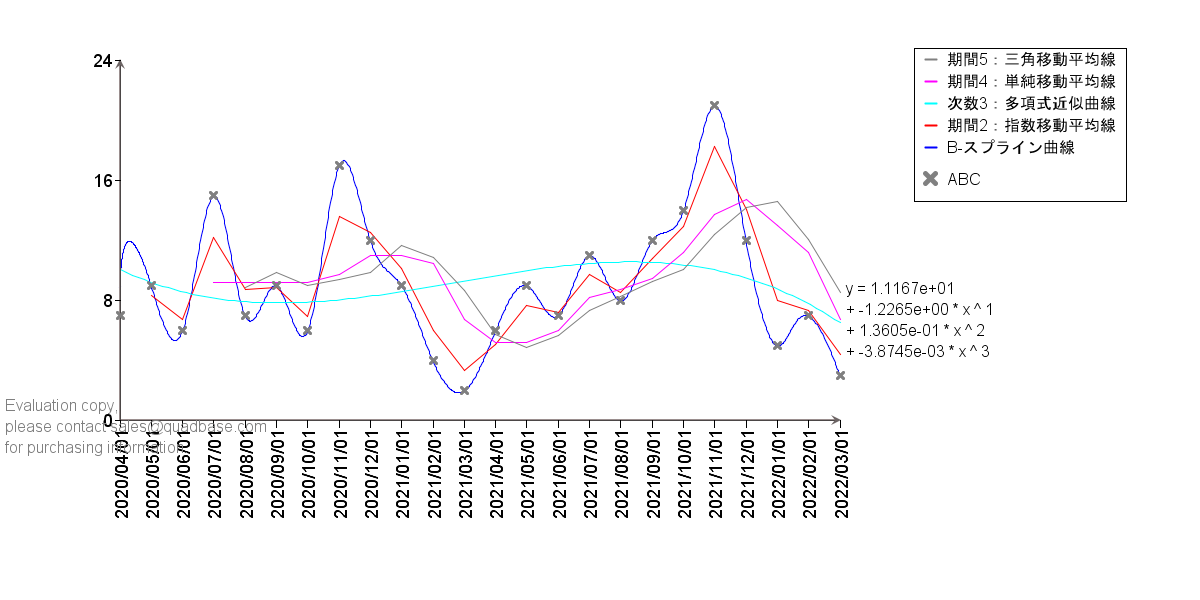
トレンドライン:ITrendLine
傾向を分析するための各種トレンドラインを描画できます。近似曲線の場合には、その曲線の定数部分を取得することも可能です。
- BSPLINE:Bスプライン曲線
- EXPONENTIAL_AVERAGE:指数移動平均
- POLYNOMIAL:多項式近似
- SIMPLE_AVERAGE:単純移動平均
- TRIANGULAR_AVERAGE:三角移動平均
import java.applet.Applet;
import java.awt.Color;
import java.io.IOException;
import java.util.Arrays;

import quadbase.ChartAPI.*;
import quadbase.util.*;

public class ITrendLineDemo1 {
    public static void main(String[] args) {
        // EspressManagerを使用しない、エクスポートのみ
        QbChart.setEspressManagerUsed(false);
        QbChart.setForExportOnly(true);

        // 適当なソースデータを作成
        String dataType[] = {"varchar", "date", "int"};
        String fieldName[] = {"Series", "month", "Y"};

        ColInfo col = new ColInfo();
        col.value = 2;
        col.series = 0;
        col.category = 1;

        String records[][] = {
            {"ABC", "2020-04-01", "7"}, {"ABC", "2020-05-01", "9"},
            {"ABC", "2020-06-01", "6"}, {"ABC", "2020-07-01", "15"},
            {"ABC", "2020-08-01", "7"}, {"ABC", "2020-09-01", "9"},
            {"ABC", "2020-10-01", "6"}, {"ABC", "2020-11-01", "17"},
            {"ABC", "2020-12-01", "12"}, {"ABC", "2021-01-01", "9"},
            {"ABC", "2021-02-01", "4"}, {"ABC", "2021-03-01", "2"},
            {"ABC", "2021-04-01", "6"}, {"ABC", "2021-05-01", "9"},
            {"ABC", "2021-06-01", "7"}, {"ABC", "2021-07-01", "11"},
            {"ABC", "2021-08-01", "8"}, {"ABC", "2021-09-01", "12"},
            {"ABC", "2021-10-01", "14"}, {"ABC", "2021-11-01", "21"},
            {"ABC", "2021-12-01", "12"}, {"ABC", "2022-01-01", "5"},
            {"ABC", "2022-02-01", "7"}, {"ABC", "2022-03-01", "3"},
        };

        DbData data = new DbData(dataType, fieldName, records);

        // 適当な折れ線チャートを作成
        Applet parent = null;
        QbChart chart = new QbChart(parent,
            QbChart.VIEW2D,
            QbChart.LINE,
            data,
            col,
            null);

        // チャート位置を調整
        IPlot plot = chart.gethChartPlot();
        plot.setPosition(new Position(0.1f, 0.1f));

        // トレンドラインが見やすいよう、接続線を非表示にし、ポイントのみを灰色で表示
        IDataPointSet point = chart.gethDataPoints();
        point.setColors(new Color[] {Color.gray});
        point.setConnectLinesVisible(false);
        point.setPointsVisible(true);

        // 凡例の位置を調整、シンボルを描画
        ILegend legend = chart.gethLegend();
        legend.setPosition(new Position(0.85f, 0.7f));
        legend.setDrawSymbols(true);

        // IDataLineSetを取得
        IDataLineSet lineset = chart.gethDataLines();

        // B-スプライン曲線を青で追加
        ITrendLine bspline = lineset.newTrendLine(
            ITrendLine.BSPLINE, 1, "B-スプライン曲線");
        bspline.setSeries("ABC");
        bspline.setColor(Color.blue);
        lineset.add(bspline);

        // 期間2の指数移動平均線を赤で追加
        ITrendLine exponential_avg = lineset.newTrendLine(
            ITrendLine.EXPONENTIAL_AVERAGE, 2, "期間2:指数移動平均線");
        exponential_avg.setSeries("ABC");
        exponential_avg.setColor(Color.red);
        lineset.add(exponential_avg);

        // 次数nの多項式近似曲線をシアンで追加
        int n = 3;
        ITrendLine polynomial = lineset.newTrendLine(
            ITrendLine.POLYNOMIAL, n, "次数" + n + ":多項式近似曲線");
        polynomial.setSeries("ABC");
        polynomial.setColor(Color.cyan);
        lineset.add(polynomial);

        // 多項式近似曲線の定数値を取得
        double[] polynomialCoeffs = polynomial.getInterpolateCoeffs();
        String[] polynomialCoeffsArray = Arrays.stream(polynomialCoeffs)
            .mapToObj(d -> String.format("%.4e", d)) // 小数点以下4桁にフォーマット
            .toArray(String[]::new);

        // 多項式近似曲線の近似式を追加
        StringBuilder formulaBuilder = new StringBuilder("y = ");
        formulaBuilder.append(polynomialCoeffsArray[0]).append(System.lineSeparator());
        for (int i = 1; i < n + 1; i++) {
            formulaBuilder.append(" + ").
            append(polynomialCoeffsArray[i]).
            append(" * x ^ ").append(i).
            append(System.lineSeparator());
        }
        String formula = formulaBuilder.toString();
        IAnnotationSet annoset = chart.gethAnnotations();
        IAnnotation polynomialanno = annoset.newAnnotation(formula, polynomial);
        polynomialanno.setRelativePosition(new Point_2D(0.005f, 0f));
        annoset.addAnnotation(polynomialanno);

        // 期間4の単純移動平均線をマゼンタで追加
        ITrendLine simple_average = lineset.newTrendLine(
            ITrendLine.SIMPLE_AVERAGE, 4, "期間4:単純移動平均線");
        simple_average.setSeries("ABC");
        simple_average.setColor(Color.magenta);
        lineset.add(simple_average);

        // 期間5の三角移動平均線を灰色で追加
        ITrendLine triangular_average = lineset.newTrendLine(
            ITrendLine.TRIANGULAR_AVERAGE, 5, "期間5:三角移動平均線");
        triangular_average.setSeries("ABC");
        triangular_average.setColor(Color.gray);
        lineset.add(triangular_average);

        try {
            chart.export(QbChart.PNG, "ITrendLineDemo1.png", 1200, 600);
        } catch (IOException e) {
            e.printStackTrace();
        }
    }
}
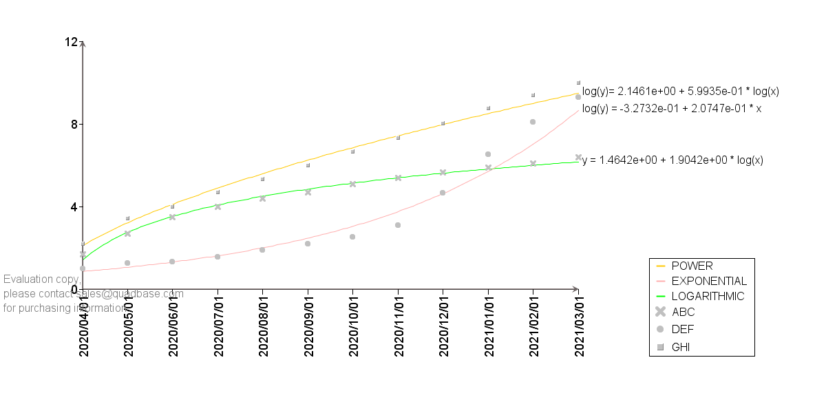
- EXPONENTIAL:指数近似
- LOGARITHMIC:対数近似
- POWER:累乗近似
import java.applet.Applet;
import java.awt.Color;
import java.io.IOException;
import java.util.Arrays;

import quadbase.ChartAPI.*;
import quadbase.util.*;

public class ITrendLineDemo2 {
    public static void main(String[] args) {
        // EspressManagerを使用しない、エクスポートのみ
        QbChart.setEspressManagerUsed(false);
        QbChart.setForExportOnly(true);

        // 適当なソースデータを作成
        String dataType[] = {"varchar", "date", "double"};
        String fieldName[] = {"Series", "month", "Y"};

        ColInfo col = new ColInfo();
        col.value = 2;
        col.series = 0;
        col.category = 1;

        String records[][] = {
            {"ABC", "2020-04-01", "1.7"}, {"ABC", "2020-05-01", "2.7"},
            {"ABC", "2020-06-01", "3.5"}, {"ABC", "2020-07-01", "4"},
            {"ABC", "2020-08-01", "4.4"}, {"ABC", "2020-09-01", "4.7"},
            {"ABC", "2020-10-01", "5.11"}, {"ABC", "2020-11-01", "5.42"},
            {"ABC", "2020-12-01", "5.67"}, {"ABC", "2021-01-01", "5.91"},
            {"ABC", "2021-02-01", "6.12"}, {"ABC", "2021-03-01", "6.4"},

            {"DEF", "2020-04-01", "1"}, {"DEF", "2020-05-01", "1.28"},
            {"DEF", "2020-06-01", "1.34"}, {"DEF", "2020-07-01", "1.57"},
            {"DEF", "2020-08-01", "1.92"}, {"DEF", "2020-09-01", "2.2"},
            {"DEF", "2020-10-01", "2.56"}, {"DEF", "2020-11-01", "3.12"},
            {"DEF", "2020-12-01", "4.67"}, {"DEF", "2021-01-01", "6.54"},
            {"DEF", "2021-02-01", "8.12"}, {"DEF", "2021-03-01", "9.32"},

            {"GHI", "2020-04-01", "2.21"}, {"GHI", "2020-05-01", "3.46"},
            {"GHI", "2020-06-01", "4.01"}, {"GHI", "2020-07-01", "4.7"},
            {"GHI", "2020-08-01", "5.35"}, {"GHI", "2020-09-01", "6.02"},
            {"GHI", "2020-10-01", "6.68"}, {"GHI", "2020-11-01", "7.35"},
            {"GHI", "2020-12-01", "8.05"}, {"GHI", "2021-01-01", "8.79"},
            {"GHI", "2021-02-01", "9.43"}, {"GHI", "2021-03-01", "10.01"},
        };
        DbData data = new DbData(dataType, fieldName, records);

        // 適当な折れ線チャートを作成
        Applet parent = null;
        QbChart chart = new QbChart(parent,
            QbChart.VIEW2D,
            QbChart.LINE,
            data,
            col,
            null);

        // チャート位置を調整
        IPlot plot = chart.gethChartPlot();
        plot.setPosition(new Position(0.1f, 0.1f));

        // トレンドラインが見やすいよう、接続線を非表示にし、ポイントのみを灰色で表示
        IDataPointSet point = chart.gethDataPoints();
        point.setColors(new Color[] {Color.lightGray, Color.lightGray, Color.lightGray});
        point.setConnectLinesVisible(false);
        point.setPointsVisible(true);

        // 凡例の位置を調整、シンボルを描画
        ILegend legend = chart.gethLegend();
        legend.setPosition(new Position(0.85f, 0.2f));
        legend.setDrawSymbols(true);

        // IAnnotationSetを取得(近似式用)
        IAnnotationSet annoset = chart.gethAnnotations();

        // IDataLineSetを取得
        IDataLineSet lineset = chart.gethDataLines();

        // 対数近似曲線を緑で追加
        ITrendLine logarithmic = lineset.newTrendLine(
            ITrendLine.LOGARITHMIC, 1, "LOGARITHMIC");
        logarithmic.setSeries("ABC");
        logarithmic.setColor(Color.green);
        lineset.add(logarithmic);

        // 対数近似曲線の定数値を取得
        double[] logarithmicCoeffs = logarithmic.getInterpolateCoeffs();
        String[] logarithmicCoeffsArray = Arrays.stream(logarithmicCoeffs)
            .mapToObj(d -> String.format("%.4e", d)) // 小数点以下4桁にフォーマット
            .toArray(String[]::new);

        // 対数近似曲線の近似式を追加
        IAnnotation logarithmicanno = annoset.newAnnotation(
            "y = " + logarithmicCoeffsArray[0] +
            " + " + logarithmicCoeffsArray[1] + " * log(x)",
            logarithmic);
        logarithmicanno.setRelativePosition(new Point_2D(0.005f, 0f));
        annoset.addAnnotation(logarithmicanno);

        // 指数近似曲線をピンクで追加
        ITrendLine exponential = lineset.newTrendLine(
            ITrendLine.EXPONENTIAL, 1, "EXPONENTIAL");
        exponential.setSeries("DEF");
        exponential.setColor(Color.pink);
        lineset.add(exponential);

        // 指数近似曲線の定数値を取得
        double[] exponentialCoeffs = exponential.getInterpolateCoeffs();
        String[] exponentialCoeffsArray = Arrays.stream(exponentialCoeffs)
            .mapToObj(d -> String.format("%.4e", d)) // 小数点以下4桁にフォーマット
            .toArray(String[]::new);

        // 指数近似曲線の近似式を追加
        IAnnotation exponentialanno = annoset.newAnnotation(
            "log(y) = " + exponentialCoeffsArray[0] +
            " + " + exponentialCoeffsArray[1] + " * x",
            exponential);
        exponentialanno.setRelativePosition(new Point_2D(0.005f, 0f));
        annoset.addAnnotation(exponentialanno);

        // 累乗近似曲線をオレンジで追加
        ITrendLine power = lineset.newTrendLine(
            ITrendLine.POWER, 1, "POWER");
        power.setSeries("GHI");
        power.setColor(Color.orange);
        lineset.add(power);

        // 累乗近似曲線の定数値を取得
        double[] powerCoeffs = power.getInterpolateCoeffs();
        String[] powerCoeffsArray = Arrays.stream(powerCoeffs)
            .mapToObj(d -> String.format("%.4e", d)) // 小数点以下4桁にフォーマット
            .toArray(String[]::new);

        // 累乗近似曲線の近似式を追加
        IAnnotation poweranno = annoset.newAnnotation(
            "log(y)= " + powerCoeffsArray[0] +
            " + " + powerCoeffsArray[1] + " * log(x)",
            power);
        poweranno.setRelativePosition(new Point_2D(0.005f, 0f));
        annoset.addAnnotation(poweranno);

        try {
            chart.export(QbChart.PNG, "ITrendLineDemo2.png", 1200, 600);
        } catch (IOException e) {
            e.printStackTrace();
        }
    }
}
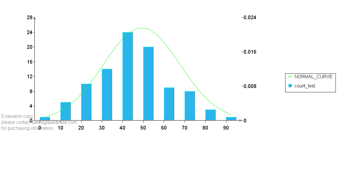
また、ヒストグラムを作成した場合にはそれに対する正規分布曲線を追加することも可能です。
import java.applet.Applet;
import java.awt.Color;
import java.io.IOException;
import java.sql.SQLException;

import quadbase.ChartAPI.*;
import quadbase.util.*;

public class ITrendLineDemo3 {
    public static void main(String[] args) {
        // EspressManagerを使用しない、エクスポートのみ
        QbChart.setEspressManagerUsed(false);
        QbChart.setForExportOnly(true);

        // 適当なソースデータを作成
        String dataType[] = {"int", "int"};
        String fieldName[] = {"test", "dummy"};

        ColInfo col = new ColInfo();
        col.value = 0;
        col.category = 0;

        String records[][] = {
            {"23", "0"}, {"15", "0"}, {"14", "0"}, {"30", "0"}, {"42", "0"},
            {"54", "0"}, {"92", "0"}, {"60", "0"}, {"53", "0"}, {"44", "0"},
            {"25", "0"}, {"34", "0"}, {"13", "0"}, {"24", "0"}, {"52", "0"},
            {"30", "0"}, {"47", "0"}, {"66", "0"}, {"74", "0"}, {"37", "0"},
            {"76", "0"}, {"65", "0"}, {"53", "0"}, {"53", "0"}, {"43", "0"},
            {"27", "0"}, {"47", "0"}, {"42", "0"}, {"27", "0"}, {"46", "0"},
            {"02", "0"}, {"49", "0"}, {"66", "0"}, {"59", "0"}, {"56", "0"},
            {"50", "0"}, {"54", "0"}, {"72", "0"}, {"43", "0"}, {"45", "0"},
            {"43", "0"}, {"13", "0"}, {"34", "0"}, {"58", "0"}, {"57", "0"},
            {"32", "0"}, {"65", "0"}, {"63", "0"}, {"63", "0"}, {"37", "0"},
            {"74", "0"}, {"36", "0"}, {"44", "0"}, {"56", "0"}, {"72", "0"},
            {"24", "0"}, {"43", "0"}, {"56", "0"}, {"54", "0"}, {"20", "0"},
            {"47", "0"}, {"44", "0"}, {"43", "0"}, {"54", "0"}, {"30", "0"},
            {"53", "0"}, {"80", "0"}, {"65", "0"}, {"40", "0"}, {"10", "0"},
            {"42", "0"}, {"34", "0"}, {"88", "0"}, {"24", "0"}, {"32", "0"},
            {"24", "0"}, {"54", "0"}, {"44", "0"}, {"51", "0"}, {"31", "0"},
            {"26", "0"}, {"73", "0"}, {"65", "0"}, {"36", "0"}, {"47", "0"},
            {"54", "0"}, {"48", "0"}, {"31", "0"}, {"44", "0"}, {"74", "0"},
            {"53", "0"}, {"84", "0"}, {"44", "0"}, {"76", "0"}, {"46", "0"},
        };

        DbData data = new DbData(dataType, fieldName, records);

        // 適当な縦棒チャートを作成
        Applet parent = null;
        QbChart chart = new QbChart(parent,
            QbChart.VIEW2D,
            QbChart.COL,
            data,
            col,
            null);

        // チャート位置を調整
        IPlot plot = chart.gethChartPlot();
        plot.setPosition(new Position(0.1f, 0.1f));

        // ヒストグラムを作成
        IHistogramInfo hisfo = chart.gethHistogramInfo();
        hisfo.setLowerBound(0);
        hisfo.setUpperBound(120);
        hisfo.setRounded(true);
        hisfo.setScale(10);
        hisfo.setHistogram(true);

        // 正規分布曲線を緑で追加
        IDataLineSet lineset = chart.gethDataLines();
        ITrendLine normal_curve = lineset.newTrendLine(
            ITrendLine.NORMAL_CURVE, 1, "NORMAL_CURVE");
        normal_curve.setColor(Color.green);
        lineset.add(normal_curve);

        try {
            chart.refresh();
        } catch (ClassNotFoundException | IOException | SQLException e1) {
            e1.printStackTrace();
        }

        try {
            chart.export(QbChart.PNG, "ITrendLineDemo3.png", 1200, 600);
        } catch (IOException e) {
            e.printStackTrace();
        }
    }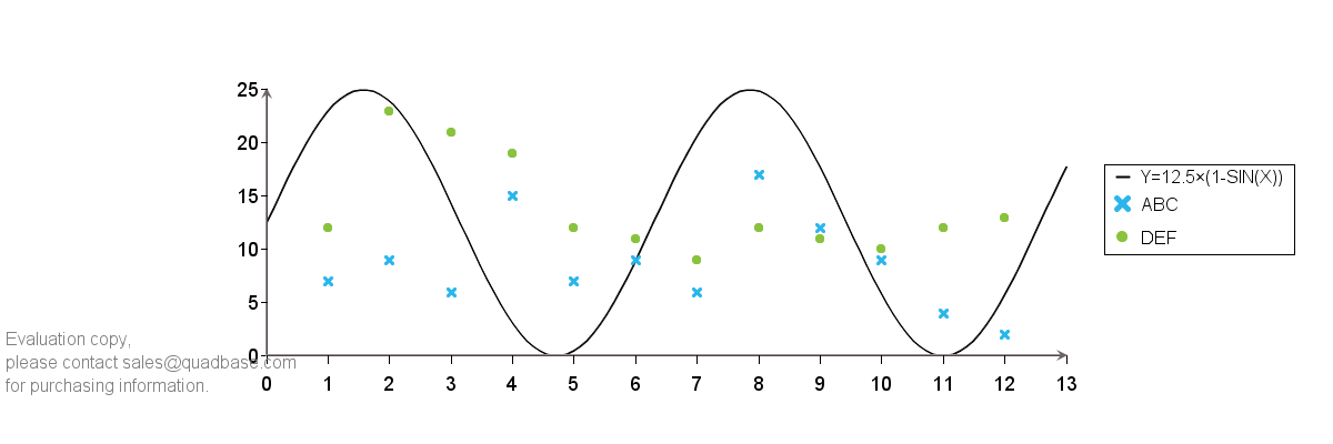
}任意関数:IFunctionLine
別途定義したIFunctionを基に、独自関数でグラフを作成します。2D 散布図(SCATTER)チャートでのみ使用可能です。
また、この独自関数はチャートのテンプレートファイル(cht/tpl など)には保存されないため、APIにて毎回描画させる必要がある点にご注意ください。加えて、線のスタイル(点線や破線など)もサポートしていません。
import java.applet.Applet;
import java.io.IOException;

import quadbase.ChartAPI.*;
import quadbase.util.*;

public class IFunctionLineDemo {
	public static void main(String[] args){
		// EspressManagerを使用しない、エクスポートのみ
		QbChart.setEspressManagerUsed(false);
		QbChart.setForExportOnly(true);

		String dataType[] = {"varchar", "double", "double"};
		String fieldName[] = {"Series", "X", "Y"};

		ColInfo col = new ColInfo();
		col.yvalue=2;
		col.series=0;
		col.xvalue=1;

		Applet parent = null;

		// 適当なソースデータを作成
		String records[][] = {
				{ "ABC","1","7" }, { "ABC","2","9"},
				{ "ABC","3","6"}, { "ABC","4","15" },
				{ "ABC","5","7" }, { "ABC","6","9"},
				{ "ABC","7","6"}, { "ABC","8","17" },
				{ "ABC","9","12"}, { "ABC","10","9"},
				{ "ABC","11","4" }, { "ABC","12","2" },
				{ "DEF","1","12" }, { "DEF","2","23"},
				{ "DEF","3","21"}, { "DEF","4","19" },
				{ "DEF","5","12" }, { "DEF","6","11"},
				{ "DEF","7","9"}, { "DEF","8","12" },
				{ "DEF","9","11"}, { "DEF","10","10"},
				{ "DEF","11","12" }, { "DEF","12","13" },
		};
		DbData data = new DbData(dataType, fieldName, records);

		// 適当な散布図チャートを作成
		QbChart chart = new QbChart(parent,
				QbChart.VIEW2D,
				QbChart.SCATTER,
				data,
				col,
				null);

		// IDataLineSetを取得
		IDataLineSet lineset = chart.gethDataLines();

		// CustomFuncで独自関数の線を作成し、追加
	    IFunctionLine fline = lineset.newFunctionLine
	    		(new CustomFunc(), "Y=12.5×(1-SIN(X))");
	    lineset.add(fline);

		try {
			chart.export(QbChart.PNG,"IFunctionLineDemo.png",1200,400);
		} catch (IOException e) {e.printStackTrace();}
	}
}
import quadbase.util.*;

public class CustomFunc implements IFunction {
       public void FunctionCustomizer() {
       }
       public double getY(double x) {
    	   return 12.5*(1+Math.sin(x));
       }
}
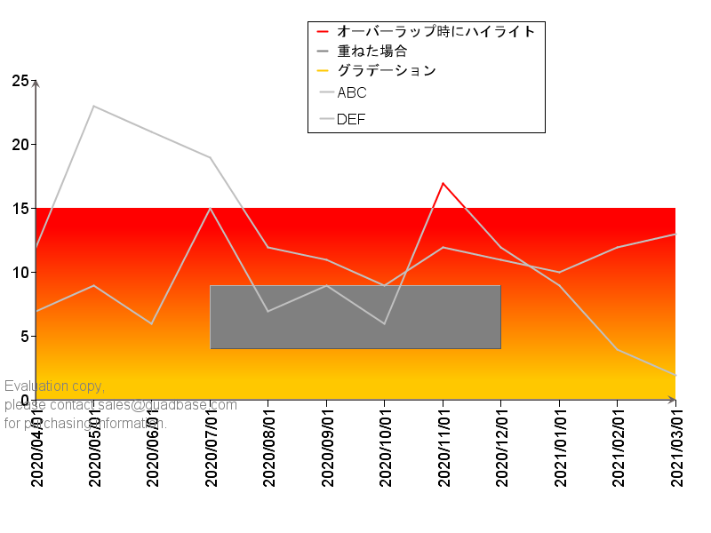
コントロールレンジ:IControlRangeSet
Y軸の値とカテゴリ(X)軸の値から特定範囲ControlRangeを作成できます。複数の範囲を作成し、重ねるための設定や、範囲内の重なったチャートプロットをハイライトすることが可能です。
import java.applet.Applet;
import java.awt.Color;
import java.io.IOException;

import quadbase.ChartAPI.*;
import quadbase.util.*;

public class IControlRangeSetDemo {
	public static void main(String[] args){
		// EspressManagerを使用しない、エクスポートのみ
		QbChart.setEspressManagerUsed(false);
		QbChart.setForExportOnly(true);

		String dataType[] = {"varchar", "date", "int"};
		String fieldName[] = {"Series", "month", "Y"};

		ColInfo col = new ColInfo();
		col.value=2;
		col.series=0;
		col.category=1;

		Applet parent = null;

		// 適当なソースデータを作成
		String records[][] = {
				{ "ABC","2020-04-01","7" }, { "ABC","2020-05-01","9"},
				{ "ABC","2020-06-01","6"}, { "ABC","2020-07-01","15" },
				{ "ABC","2020-08-01","7" }, { "ABC","2020-09-01","9"},
				{ "ABC","2020-10-01","6"}, { "ABC","2020-11-01","17" },
				{ "ABC","2020-12-01","12"}, { "ABC","2021-01-01","9"},
				{ "ABC","2021-02-01","4" }, { "ABC","2021-03-01","2" },
				{ "DEF","2020-04-01","12" }, { "DEF","2020-05-01","23"},
				{ "DEF","2020-06-01","21"}, { "DEF","2020-07-01","19" },
				{ "DEF","2020-08-01","12" }, { "DEF","2020-09-01","11"},
				{ "DEF","2020-10-01","9"}, { "DEF","2020-11-01","12" },
				{ "DEF","2020-12-01","11"}, { "DEF","2021-01-01","10"},
				{ "DEF","2021-02-01","12" }, { "DEF","2021-03-01","13" },
		};
		DbData data = new DbData(dataType, fieldName, records);

		// 適当な折れ線チャートを作成
		QbChart chart = new QbChart(parent,
				QbChart.VIEW2D,
				QbChart.LINE,
				data,
				col,
				null);

		// チャート位置を調整
		IPlot plot = chart.gethChartPlot();
		plot.setPosition(new Position(0.05f,0.15f));
		plot.setRelativeWidth(.9f);

		// 凡例位置を調整
		ILegend legend = chart.gethLegend();
		legend.setPosition(new Position(0.6f,0.8f));

		// チャートプロットの色をライトグレーに
		IDataPointSet point = chart.gethDataPoints();
		point.setColors(new Color[] {Color.lightGray, Color.lightGray});

		// IControlRangeSetを取得
		IControlRangeSet crset = chart.gethControlRanges();

		// グラデーションを有効にしてY軸0から15のコントロールエリアcrAを作成
		ControlRange crA =
				new ControlRange(0.0,15.0,Color.orange,"グラデーション",false);
		crA.setGradientEnabled(true);
		crA.setGradientDesColor(Color.red);
		crA.setGradientStartY(0.9);
		crA.setGradientEndY(0.1);
		crA.setGradientStartX(0.5);
		crA.setGradientEndX(0.5);
		crA.setGradientCyclic(false);
		crA.setShowInLegend(true);
		crA.setDepth(0);
		crset.addElement(crA);

		// crA内にい追加のコントロールエリアcrBを作成、
		// レイヤーをより上位にし、浮き上がるようにAppearanceを設定
		ControlRange crB =
				new ControlRange(4.0,9.0,Color.gray,"重ねた場合",false);
		crB.setScale2Enabled(true);
		crB.setStartScale2(3);
		crB.setEndScale2(8);
		crB.setAppearance(QbChart.RAISE);
		crB.setShowInLegend(true);
		crB.setDepth(1);
		crset.addElement(crB);

		// Y軸15から25、カテゴリ軸5から10項目のコントロールエリアcrCを作成、
		// 重なったチャートプロットの色を変更するように設定
		ControlRange crC =
				new ControlRange(15.0,25.0,Color.red,"オーバーラップ時にハイライト",false);
		crC.setScale2Enabled(true);
		crC.setStartScale2(5);
		crC.setEndScale2(10);
		crC.setOverlapAreaHighlighted(true);
		crC.setShowInLegend(true);
		crset.addElement(crC);

		try {
			chart.export(QbChart.PNG,"IControlRangeSetDemo.png",800,600);
		} catch (IOException e) {e.printStackTrace();}
	}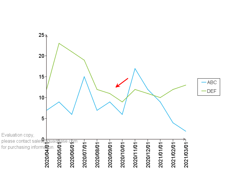
}線の追加:IFloatingLineSet
座標の配列からそれらを繋ぐPolyLineを作成し、線として描画できます。キャンバス上の座標を基にしていますので、チャートプロットの座標から位置を算出するためには変換が必要になる点に注意してください。
import java.applet.Applet;
import java.awt.Color;
import java.io.IOException;
import java.util.Vector;

import quadbase.ChartAPI.*;
import quadbase.util.*;

public class IFloatingLineSetDemo {
	public static void main(String[] args){
		// EspressManagerを使用しない、エクスポートのみ
		QbChart.setEspressManagerUsed(false);
		QbChart.setForExportOnly(true);

		String dataType[] = {"varchar", "date", "int"};
		String fieldName[] = {"Series", "month", "Y"};

		ColInfo col = new ColInfo();
		col.value=2;
		col.series=0;
		col.category=1;

		Applet parent = null;

		// 適当なソースデータを作成
		String records[][] = {
				{ "ABC","2020-04-01","7" }, { "ABC","2020-05-01","9"},
				{ "ABC","2020-06-01","6"}, { "ABC","2020-07-01","15" },
				{ "ABC","2020-08-01","7" }, { "ABC","2020-09-01","9"},
				{ "ABC","2020-10-01","6"}, { "ABC","2020-11-01","17" },
				{ "ABC","2020-12-01","12"}, { "ABC","2021-01-01","9"},
				{ "ABC","2021-02-01","4" }, { "ABC","2021-03-01","2" },
				{ "DEF","2020-04-01","12" }, { "DEF","2020-05-01","23"},
				{ "DEF","2020-06-01","21"}, { "DEF","2020-07-01","19" },
				{ "DEF","2020-08-01","12" }, { "DEF","2020-09-01","11"},
				{ "DEF","2020-10-01","9"}, { "DEF","2020-11-01","12" },
				{ "DEF","2020-12-01","11"}, { "DEF","2021-01-01","10"},
				{ "DEF","2021-02-01","12" }, { "DEF","2021-03-01","13" },
		};
		DbData data = new DbData(dataType, fieldName, records);

		// 適当な折れ線チャートを作成
		QbChart chart = new QbChart(parent,
				QbChart.VIEW2D,
				QbChart.LINE,
				data,
				col,
				null);

		// IFloatingLineSetを取得
		IFloatingLineSet flineset = chart.gethFloatingLines();

		// Vectorで座標配列を作成
		Vector<Point_2D> vector = new Vector<Point_2D>();
		vector.add(new Point_2D(0.55f,0.55f));
		vector.add(new Point_2D(0.5f,0.5f));

		// PolyLineを作成し、座標間をつなぐ赤色の線、太さ3、終点を矢印に設定
		PolyLine pl = new PolyLine();
		pl.set(vector.elements(), Color.red);
		pl.setThickness(3);
		pl.setArrowAtEndPointVisible(true);

		// IFloatingLineSetに追加
		flineset.add(pl);

		try {
			chart.export(QbChart.PNG,"IFloatingLineSetDemo.png",800,600);
		} catch (IOException e) {e.printStackTrace();}
	}
}
関連するトピックス:
- Ver5からのフォントサイズ【Javaチャート・グラフ作成ツールEspressChart】
- チャート・グラフをWeb上に展開するプログラム【Javaチャート・グラフ作成ツールEspressChart】
- 複数チャートの描画について【EspressChart:API使用方法】
- 画像(キャンバス)サイズを変えずにグラフのみサイズを変える方法[EspressChart]
- チャート座標と画像座標の変換方法[EspressChart]
- 棒グラフの色を各棒ごとに手動で設定を行う方法
- データ表を簡易描画【EspressChart:API使用方法】
- EspressChartのAPIを使用してのチャートの色やプロットの形を指定する方法【Javaチャート・グラフ作成ツールEspressChart】
- エリアグラフへの境界線表示方法【Javaチャート・グラフ作成ツールEspressChart】
- EspressChartでDB・テキストファイルから動的グラフ作成(APIからの編集, Servlet利用編)

 RSSフィードを取得する